Over here at the Galactic Fed blog, we share many SEO and paid media tips to help increase website traffic. And if you’ve implemented some of these tips, we’re sure you’re attracting visitors left, right, and center.
But converting them into customers is a whole ‘nother ball game, which is why we’re here today. It’s time to increase your conversion rate.
What’s a conversion rate? In a nutshell, it’s the percentage of visitors who perform a desired action (in other words, convert). This action depends on your website or campaign goals, but common ones are purchasing a product, registering for a webinar, or signing up for a service.
How do you measure your conversion rate? You divide the number of conversions by the number of visitors (or sessions) and multiply this number by 100.
So if 50,000 people visit your e-commerce store, and 1,000 of them buy something, your store has a 5% conversion rate.
What’s a good conversion rate? Well, for e-commerce businesses, the average ranges between 2-3%. But we’re not here to be average. We’re here to help you optimize and grow your conversion rate. Conversion rate optimization, or CRO, is all about enhancing your website and content to boost conversions.
Where do we sign up? Oh, how convenient.

That was pretty meta, wasn’t it? If we’ve converted you (to read on), we’ve met our goal. Now it’s time to reach yours. From our experts to you, here are 5 powerful tips for improving your CRO.
1. Shorten the checkout funnel
Remember that time you were searching for slippers as a gift for your dad and came across these loafers:

Source: Buzzfeed
As a dad who tells dad jokes, he would love it. But when you went to purchase it, you had to become a member. Although a bit annoyed that you couldn’t checkout as a guest, you click to sign up—for the sake of giving the perfect gift. You supply your name, email, phone number, and address, and click submit. You’re now asked your preferences for slippers?! Enough is enough, you bounce.
Why? Because the checkout funnel was too long.
A checkout funnel is a path of URLs that you expect your website users to follow after they initiate the checkout, up until the final transaction. The more steps you add to this process, the more chances you give the customer to walk away from the purchase.
What’s the solution?
- Keep the steps short and simple: If you’re an e-commerce store, all you should be asking for is the contact information, shipping information, and payment method. Let them checkout as a guest. If they have a positive experience now, you can entice them to sign up for your loyalty program and newsletter—or cough up more information about their preferences—later.
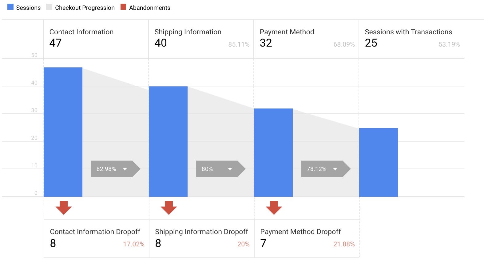
- Monitor the checkout flow in Google Analytics and tweak accordingly: Don’t make guesses or assumptions about when they bounce. If you configure your checkout funnel in the Google Analytics interface, you can see exactly where users are dropping off.
To configure the funnel steps, you will need to go to your Google Analytics dashboard > Admin > E-commerce Settings (under view) > Enable Enhanced E-commerce Reporting. Here you can create readable names for your funnel steps, such as:
- Contact Information
- Shipping Information
- Payment Method
Once it’s set up, you will start seeing data populating in your Checkout Behavior report with the checkout steps as shown:

Source: Little Data
If one URL sees a large drop-off, it’s time to do some investigating. Ask yourself these simple questions: Is it easy to convert? Is it clear how to convert? Optimizing your CRO will always boil down to ease and clarity.
2. Improve page speed
Perhaps your checkout funnel is simple, but if your website has slow load times, you could be losing out on a ton of conversions.
Think about the time between ordering food off UberEats and the time the order is processed. What is that, a few seconds? It feels like hours when you’re hangry.
When it comes to page load times, it’s the same deal.
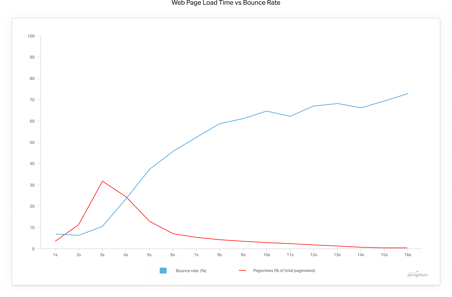
The graph below shows that the average bounce rate for pages loading within 2 seconds is 9%. As soon as the page load time surpasses 3 seconds, the bounce rate soars, and it’s at 38% by the time it hits 5 seconds!

Source: Pingdom
Now that we know how page load times may impact your conversion rate, how can you fix your page speed?
First, see if you even have a problem—plug your website in Google Analytics’ PageSpeed Insights tool to assess your load times.
If your website requires a facelift in the speed department, here are three easy places to start:
- Enable compressions: Use a software application like Gzip for file compression, to reduce the size of your CSS, HTML, and JavaScript files that are larger than 150 bytes.
For images, compress them in a program like Photoshop, where you can retain control over the image’s quality. Be sure that your images are no larger than they need to be, that they are in the right file format (PNGs are generally better for graphics with fewer than sixteen colors, while JPEGs are generally better for photographs) and that they’re compressed for the web.
- Minify CSS, JavaScript, and HTML: By optimizing your code (including removing spaces, commas, and other unnecessary characters), you can dramatically increase your page speed. We also recommend removing code comments, formatting, and unused code.
- Reduce redirects: Each time a page redirects to another page, your visitor faces additional time waiting for the HTTP request-response cycle to complete. For example, if your mobile redirect pattern looks like this: “example.com -> www.example.com -> m.example.com -> m.example.com/home,” each of those two additional redirects makes your page load slower.
Once you address some of these issues that are slowing you down, your CRO is bound to speed up.
3. Use landing pages
Remember that other time when you came across an ad for an automatic potato masher? You were in awe that you hadn’t come across it before. It had you right away with “mash your potatoes in under a minute.”
You clicked the ad—and landed on an e-commerce store’s homepage. You see pots and pans, knife sets, and those darn manual potato mashers, but not the automatic one. What gives? You bounce.

Source: Meme Maker
Time and again, we see businesses spending tons of money on their PPC ad campaigns but send interested prospects to a general web page. With this approach, there are many missed opportunities.
With landing pages, you can create focused experiences for prospects clicking on each of your ads—making it easier for them to convert.
What exactly is a landing page? A landing page is a standalone web page created specifically for a marketing or advertising campaign. It’s where a prospect “lands” after they click on an advertisement—and should reflect the same conversion goal as the ad, such as sales or lead generation. Peep this blog post on how to create high-converting landing pages.
How do you build landing pages? We recommend using a landing page builder. Several easy-to-use platforms offer 14-day free trials:
Once you sign up and start building some landing pages, we recommend creating different landing page variants for some good ol’ A/B testing. Perhaps a certain image or CTA button is attracting more conversions. When it comes to optimizing your use of landing pages, it’s all about testing!
Food for thought: According to Unbounce, users can remove the legwork of A/B testing using its Smart Traffic feature. Smart Traffic uses artificial intelligence to send your landing page variants to the right people at the right time. Users reported an average conversion lift of 30%. Hmm… Could AI be the key to improved CRO? Something to think about for all those automatic potato masher companies.
4. Make your value proposition clear
As a business owner, you’re not crazy to want to show off your product’s bells and whistles. But here’s why it shouldn’t be your copy’s primary focus: it doesn’t clearly demonstrate the value to users.
To convert prospects, you need to show them the benefits of doing so. That’s where your unique value proposition (UVP) comes in. To build your UVP, ask yourself these questions:
- How are you solving a problem of theirs?
- How are you enhancing an aspect of their life?
- Why are you a better choice than your competitor?
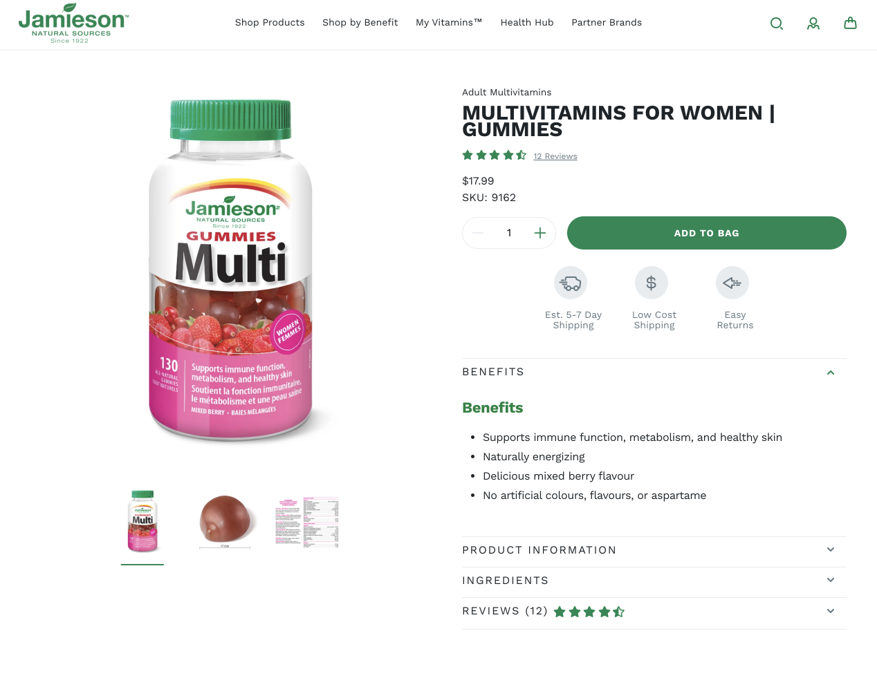
There are a lot of good (and poor) examples in the supplements industry. We get it—it’s hard not to gloat about a pill that has 13 vitamins, 10 minerals (including gold flakes), probiotics, and kale. But all that information is fluff to the average prospect. Let’s take a look at how Jamieson Natural Sources does it right:

Source: Jamieson Natural Source
This multivitamin’s benefits are front and center on both its product packaging and in the web copy. At this point, we have no idea what’s even in it! But we do know what it does for us—who doesn’t want healthy skin?
After spilling the benefits, they then support their value proposition with the ingredients list and reviews. Reviews, a form of social proof, help confirm value. People like me like this product? Well then, I should like it! It’s simple math, really.
And hey— if you’re looking for more ways to boost conversions, don’t underestimate the power of promotions and discounts. Not only do they provide value, but they also provide immediate value. It’s hard to say no to that.
5. Optimize your use of CTAs
You just wrote some killer benefit-driven copy. What’s the jelly to its peanut butter? A strong CTA.
A CTA, or call to action, is a short phrase that guides the audience to a desired action. It’s where prospects click to convert—and is usually in the form of a button. Although there’s not a lot of copy involved, you need to make sure it’s clear and purposeful. Not to quote rapper Eminem, but your CTA is your one shot, one opportunity, to seize all the conversions you ever wanted. So don’t let it slip—let’s make it happen.
When crafting a compelling CTA…
- Ensure it includes powerful action verbs: Let’s not beat around the bush here. If you want them to sign up for your yodeling class, say so: “Sign up for Yodeling!” If your body copy has done its job, you’ve already demonstrated the benefits of signing up (becoming the most popular kid in school, duh). So your CTA doesn’t need to be fancy. It should, however, empower the audience to click it!
- Remove ambiguity: A common mistake is keeping a CTA too simple—to the point of ambiguity. Although they should be clear and direct, they should still tell the reader what to expect by clicking the button. “Get started,” “learn more,” and “try it” are all examples of CTAs being a little too obscure. Get started doing what? Learn more about what? Try it—what’s it?! Pressing the CTA button is a commitment, and people want to know what they sign up for.
When publishing a CTA…
- Repeat it throughout your copy: Again, this boils back down to ease. Expecting a prospect to scroll back up to click on the CTA is crazy talk—and will hurt your conversion rate. We’re not saying to post it after every other sentence, but make sure it’s conveniently there for them to click on.
- A/B test: Your CTA button is great for A/B testing. Are certain words attracting more conversions? A color? Positioning? Oh, the options. Although A/B testing can be tedious, with so many conversions at stake, we say it’s worth the effort.
So You Think You Can Convert?
By researching ways to improve your CRO, you’re one step closer to boosting your number of highly-qualified leads, increase revenue, lower acquisition costs, obtain greater value from your current leads and customers, and simply, grow better.
Not a bad day at the office.
When it comes to your conversion rate, remember—the sky’s the limit. And we’ve got a skilled group of digital marketing experts to help get you there. All you gotta do is ask!

